
Choosing the right color for your logo can be complicated if you don’t know the meaning of the colors.
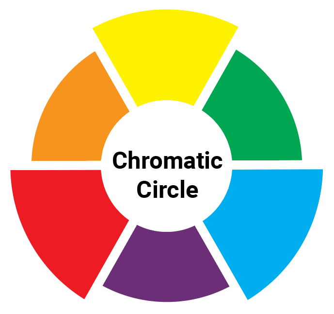
Colors are made up of three primary colors and 3 secondary colors. The primary colors are Yellow, Red, and Blue. When we mix two of these colors, it gives us a secondary color (by mixing red and yellow you get orange).
For the logos, this gives us 6 colors to which we will add brown (the mixture of the 3 primaries) as well as black (which is considered a shade) but also the two-color and the multi-color for a total of 10 colors.
Before you can choose a color for your logo, you need to know what that color represents.
And since I’m in a great mood, let’s start with yellow!
1/ Yellow
Yellow is like the sun: Joy, Optimism, Warmth, and Energy. Being able to write down an idea before losing it, the joy and carefree attitude of a child, or even the energy for your car, yellow is a very popular color in the consumer environment.
2/ Green
Green symbolizes Natural, Growth, and Wealth. We are in something solid and growing, if your product is natural (or eco-friendly) this is exactly the color to choose. Did you know that in Europe, McDonald’s logo is green?
3/ Blue
Blue symbolizes Smart, Trust, Intelligence, Dependable but also Calm. It is therefore not surprising that we find a lot of brands that need to reassure their customers. There are also a lot of social networks that use this color Like Facebook, Twitter, or LinkedIn.
4/ Purple
Purple symbolizes Spirituality, Adventure, and Prosperity. We enter here into the realm of dream and imagination; we eat food that makes us travel to the point that we might believe that everything is possible. Many lingerie brands also use this color.
5/ Red
Red symbolizes Strength, Bold, Excitement, Pleasure, Passion, and Love. We find bold brands, tasty foods that we love, the endless possibilities of a game of construction. Dare to show who you really are by becoming a presenter on your own channel! Build anything you can think of without limit.
6/ Orange
Fairly close to yellow and red, orange symbolizes joy, family, friends but also confidence and value. This color represents the confidence and pleasure we will have in using your product whether you represent the pleasure of DIY, driving a renowned motorcycle, or even a pleasure drink.
7/ Brown
Brown is different, neither a primary nor a secondary color, it is not a color that will make you dream or will put you in a good mood but it still has some good sides! Brown is the color of earth and wood, something timeless that you know you can count on it. Depending on the color of the product you sell, this color can be very effective (coffee, chocolate, soil, or wood).
8/ Black
Let’s start by defining what black is. Black is not a color it is a tint/shade. No need to stare at rainbows, you will never find it there, simply because black is the absence of light, of color. Even more special than brown, black is chosen by these brands who want to be radically different. Brands that have chosen to use this shade are brands that want to be Professional, Intelligent with a little bit of Mystery but generally, it is commonly found in the logos of high-end products.
9/ Two-color
A logo does not have to be monochrome; you can put a second color to shade how you want people to feel while thinking of your brand. The joy of having furniture at smart prices. Eating something good without having to cook. An efficient delivery service you could trust. A safe way to spend in order to please yourself.
10/ The Mix (Harlequin)
Generally, we will try not to have more than two colors to avoid the Harlequin effect. But some brands have decided to take the risk in order to highlight the fact that customers will find everything they are looking for.
Now that you know what colors are, it is time to make a choice.
Now it’s starting to get interesting! You will have to make a choice and it will completely influence the image people will have of your brand. We can either address the qualities of your product, the values of your company, or even what the user of your product might feel.
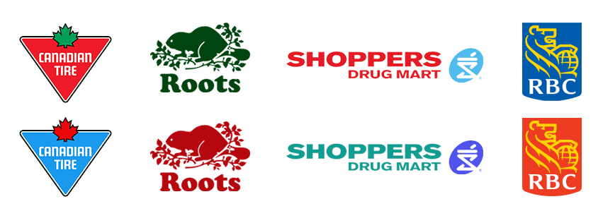
Here are some examples of logos I’ve changed the color; you will see that the feeling while looking at them is not the same:
To sum up
The good news here is, there is no bad choice, but you will have to be aware of the colors influence. It is therefore completely impossible for me to give you the perfect color for your brand. I can only advise you based on the information provided about your brand and customers. Note: in general, the person who will create your logo should always suggest two or three colors (in addition to the design of the logos).